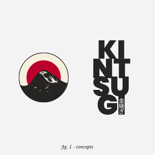
/ KINTSUGI
Industry Mindfulness / Asset Logo / Year 2025

A minimal identity inspired by resilience and place.
/01 THE CHALLENGE
Create a logo that captures the calm and depth of Japanese culture, the philosophy of kintsugi and the quiet strength of a Nordic setting, without becoming literal or decorative.
/02 THE APPROACH
The process started with research into Japanese symbolism and the kintsugi technique, combined with Nordic colour palettes and landscape references. Cultural elements were distilled to their essence, focusing on balance, restraint and meaning rather than ornament.
/03 THE RESULT
A minimal and contemplative mark built around a Japanese red circle, fractured by a kintsugi inspired line. The crack subtly follows the border of Norway, grounding the identity in place while symbolising healing, imperfection and renewal. The result is a calm, timeless logo that bridges culture, geography and philosophy with quiet confidence.


/ DISCUSS YOUR BRAND
