/ DADDY KUKU
Industry Fast food / Asset Logo / Year 2024

A bold fast food identity rooted in Amsterdam culture.
/01 THE CHALLENGE
Create a distinctive brand identity for an Amsterdam born fast food concept, one that balances tropical energy with a contemporary urban edge, and stands out in a crowded, trend driven food market.
/02 THE APPROACH
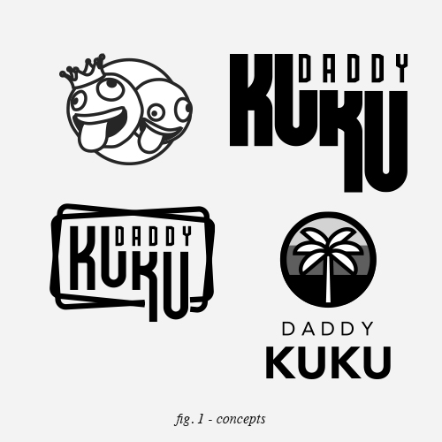
Define a visual language rooted in contrast. Tropical warmth paired with bold structure. Amsterdam heritage translated subtly rather than literally. A custom typeface was developed to give the brand a unique voice, supported by a graphic system that feels playful, confident and instantly recognisable.
/03 THE RESULT
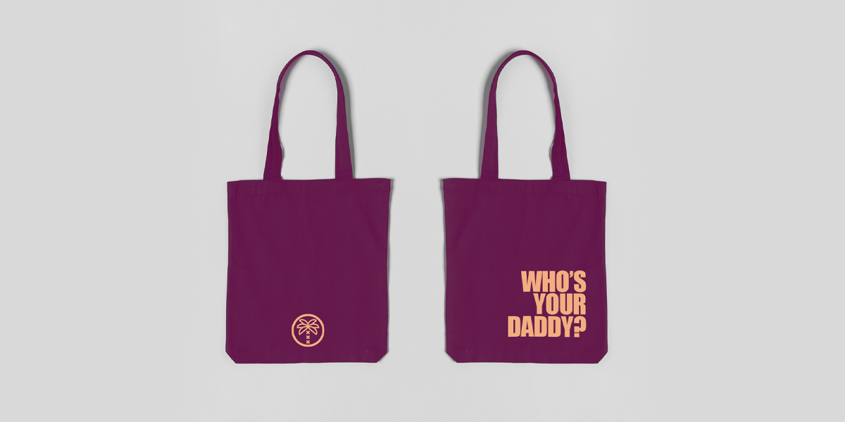
A bold and memorable identity that feels both local and unexpected. The custom typography anchors the brand, while the palm icon integrates the three iconic Amsterdam XXX into its trunk, creating a symbol that is expressive, scalable and unmistakably Daddy Kuku. The result is a flexible visual system built for fast paced environments, street presence and long term recognition.


/ DISCUSS YOUR BRAND
