/ ALL CASES
Selected branding and design projects

Romanticized Society
A contemporary jewellery identity balancing romance and restraint.
An identity built on contrast, softness against edge, emotion against structure. Classic symbolism is reduced to refined, modern forms, creating a visual language that feels intimate, confident and timeless.
View case →

Laundique
A refined brand identity rooted in clarity, quality and modern heritage.
The identity is driven by a precise typographic system and calm composition, designed to scale effortlessly across packaging, print and digital. Considered, functional and built for longevity.

Daddy Kuku
A bold fast food identity rooted in Amsterdam culture.
The logo combines a bold palm icon with Amsterdam’s iconic XXX, creating a modern, playful mark with strong local character and instant recognition.

Kintsugi
A minimal identity inspired by resilience and place.
The logo blends the philosophy of kintsugi with geographic context. A fractured form represents imperfection and repair, resulting in a calm and deliberate identity.

Van Steenes & van Raam
A refined identity built on clarity, authority and trust.
The identity relies on strong typographic contrast and precise composition, pairing classic letterforms with a contemporary structure for a confident and timeless result.

Studio Outlaw
A bold identity rooted in strength, heritage and independence.
The identity centers on a sharp, geometric longhorn skull, reduced to a bold and recognisable symbol that balances tradition with a modern, confident attitude.

Toned Amsterdam
A playful yet structured identity built around colour and contrast.
The brand is defined by vibrant colour combinations supported by a minimal icon system, allowing colour to lead while keeping the identity clear, recognisable and scalable.

B4Men
A personal identity with character and edge.
A bold and expressive visual language combines strong illustration with clear typography, creating an identity that stands out with confidence and clarity.

Oriana
A refined identity focused on balance, growth and leadership.
The mark is built from natural forms and symmetrical geometry, creating a calm and trustworthy identity that expresses clarity, direction and stability.

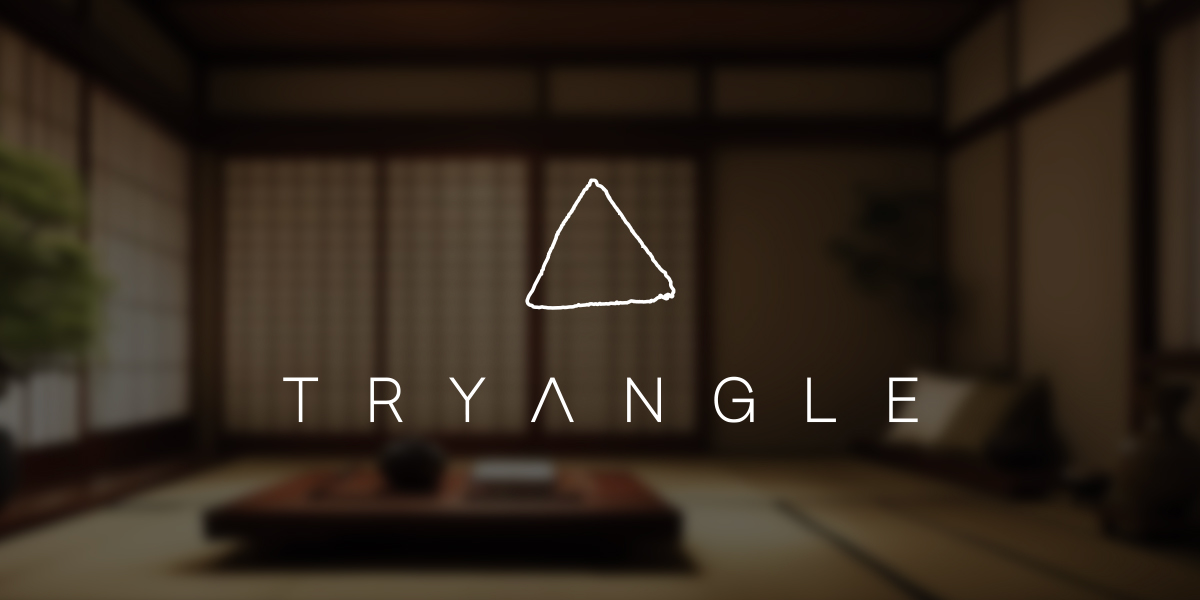
Tryangle
A minimal identity built around focus, balance and intention.
The brand is built around a single geometric anchor, creating a calm and coherent visual system focused on clarity and long term usability.
/ DISCUSS YOUR BRAND
Typically responds within 1–2 business days.
