Don’t get left behind, jump into 21st Century Design.
A logo should speak on behalf of a company and make the first impression count. Simplicity and subtle design, paired with a touch of edge, create a mark that is both professional and elegantly personal. With over 20 years of experience, this balance is crafted into every creation, ensuring the result resonates and endures. For those seeking a unique and professional logo or design, this is the place to start the conversation. We deliver all the (source) files you need efficiently alongside a brand guideline to ensure your brand development is seamless, timely and ultimately out of this era.
Collaborating with the best.


Get in touch; bring your vision to life.
info@21-design.nl
KvK: 81536801
NL84 ABNA 0888426704
ABNANL2A ABN AMRO

Daddy Kuku
The Daddy Kuku logo delivers bold impact through its oversized geometric typography, contrasted with the narrower “Daddy” placed above for balance and hierarchy. The warm peach tone adds a playful yet confident energy, making the design approachable while retaining a strong presence. Accompanied by a simple palm tree enclosed in a circle as an additional mark, the brand identity evokes a relaxed, sun-soaked atmosphere with a touch of tropical character.


©️ 2025 – 21 Design – All Rights Reserved – Privacy policy

Kintsugi
The Kintsugi logo unites cultural symbolism with geographic identity, featuring a deep red circle split by a golden crack that mirrors the border of Norway at the brand’s location. Inspired by the Japanese art of kintsugi, the design transforms imperfections into beauty, conveying resilience and renewal. The palette draws from both Norwegian heritage and the traditional colors of kintsugi, creating a visual narrative that bridges tradition, place, and the philosophy of healing.


©️ 2025 – 21 Design – All Rights Reserved – Privacy policy

Tryangle
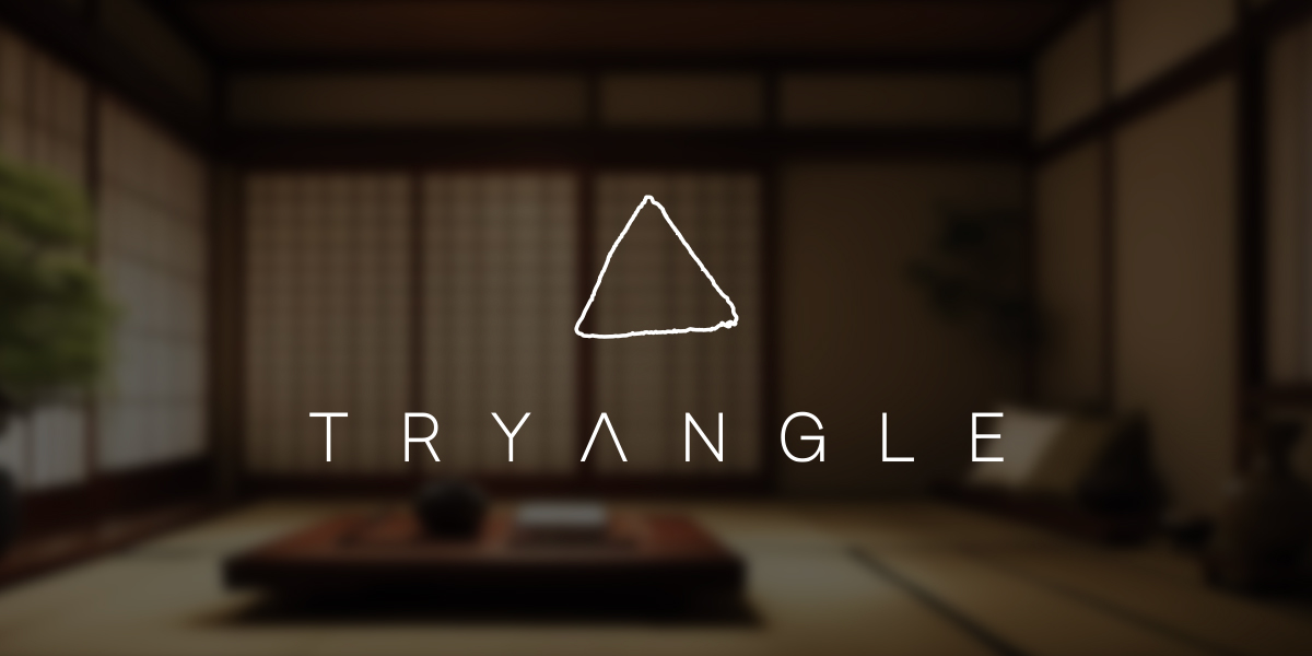
The Tryangle logo blends minimal design with an earthy, textured triangle that serves as both a visual anchor and a symbolic cue. Its custom typography incorporates the triangle form into the brand name, reinforcing unity between icon and text. The tagline “Hit pause. To press play.” captures the essence of mindfulness, suggesting that stepping back is often the key to moving forward. The overall aesthetic balances raw authenticity with thoughtful simplicity, reflecting a brand grounded in presence and purpose.


©️ 2025 – 21 Design – All Rights Reserved – Privacy policy

Studio Outlaw & Co.
The Studio Outlaw & Co. logo combines bold geometry with symbolic depth, featuring a stylized longhorn skull formed from sharp, angular shapes. At its center, a cross motif adds a distinctive focal point, blending themes of strength, heritage, and resilience. The warm gold gradient contrasts with the clean black typography below, creating a modern yet rugged identity that reflects a spirit of independence and craftsmanship.


©️ 2025 – 21 Design – All Rights Reserved – Privacy policy

Laundique
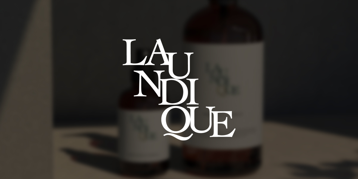
The Laundique logo presents a refined interplay of typography and composition, with its letters cascading diagonally to create a sense of movement and elegance. The deep green and warm gold color palette evokes sophistication while maintaining a natural, timeless quality. The careful balance of serif letterforms gives the identity a classic yet contemporary appeal, reflecting a brand that values both heritage and modernity.


©️ 2025 – 21 Design – All Rights Reserved – Privacy policy

Romanticized Society
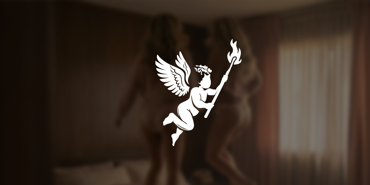
A timeless emblem featuring a cherub in flight, carrying a burning match as a symbol of passion, enlightenment, and creative spirit. The design blends classical inspiration with a modern, minimal vector style, combining elegance with versatility. Warm golden tones and flowing forms evoke a sense of nostalgia and romance and a bit of edgy, perfectly reflecting the refined yet imaginative identity of Romanticized Society.


©️ 2025 – 21 Design – All Rights Reserved – Privacy policy